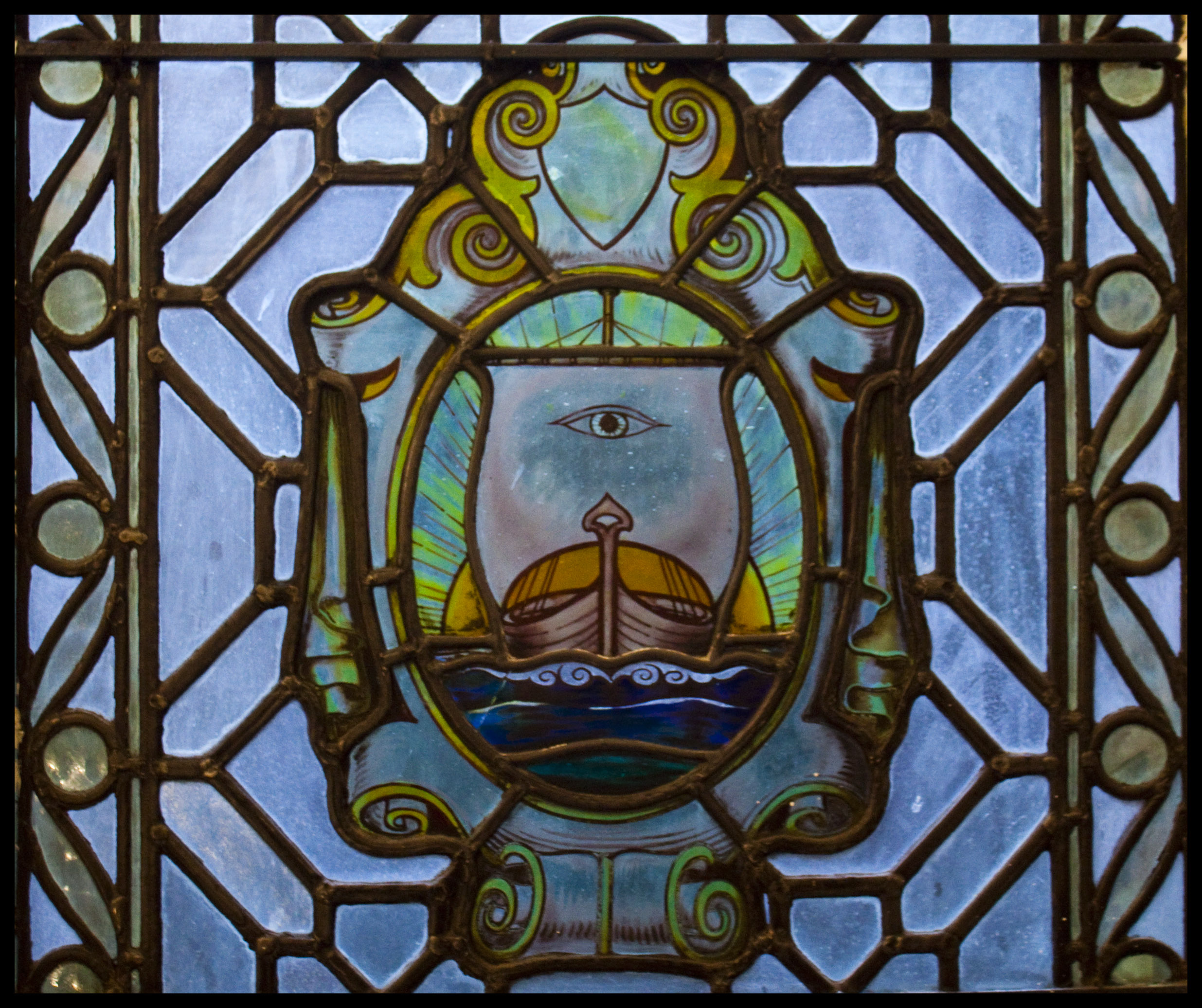
The original design by Scottish artist Herbert MacNair in 1905. The boat (typical Egyptian design) represents the journeys to tropical destinations and the eye in the sail is the Egyptian Falcon god Horus, who was connected with healing and protection from evil. Unfortunately, this beauty was replaced by a modern logo in 2009 (see the difference here).

6 responses
Yet more dubbing down of famous institutions to suit corporate ambitions.
The new Logo looks like a Puffin’s Beak, don’t believe me?
Just look at some images on Google of Puffins.
Stand up for the old School Emblem !
Amen.
The old logo, as displayed in wooden the floor as you exit the building, is different. Upside down it clearly looks like an evil face, very reminiscent of 19th century illuminati (secret society) figurines, with the all-seeing-eye of Horus, on the forehead of the face, representing the pineal gland in modern medicine, or hidden knowledge.
Thanks for the nice interpretation 🙂 Perhaps the designer wanted that effect whenever the logo was to be seen upside down!?
Yes I believe they did. Only once you have been inside, and are leaving, can you see it from this angle, but it is very interesting. I’d take a picture for you, but there’s no way of me posting it via this form. I imagine it is invisible to the uninitiated. Seek, and thee shall find.
I’m intrigued now! If you do walk by it again, you can upload and send it on the ‘About’ page and I will post it here as an homage to this riveting discovery! 🙂